Posts

Showing posts from May, 2017

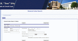
Bad - J.K. "Jess" Irby Clerk of the Court Alachua County, Florida
Image
Docket Search Alachua County Clerk of Court   The website is awkwardly placed inside of the county’s website. Although the layout and background is very refreshing, I think it should have been separated from the county website. The section under the header contains a links to information along with “+” signs beside some links. When the sign is clicked, it takes you to another page within the section. I think this is not a good use of the plus sign because I was expected the additional information to be dropped down. The “home” button takes you to the home page of that section, which I feel should be clarified better or removed. For example, it should say “Family Law Home” so that is where you can expect to go. Additionally, if I am on the family law home page but I click the plus sign for the “Fees” section; I think the body of the website should automatically change to the home page. Instead, the user must click the plus sign then click home to go to that page.  ...

Bad - Barry Baker, Clerk of the Court Suwannee County, Florida

Image
Worst Website Suwannee County Clerk of the Court The name of the website initially threw me off. It says suwgov.org, which shows no indication of the clerk of courts. I confused it for the government website, so it was hard to locate on google. The layout looks very amateur. The logo at the bottom looks very awkward because the image still has the white background on it. I could not find the docket search and ended up searching it on google. Even after searching it, I could not find it. With or without a docket system, this is not a good look. It should have been on the home page if it exists. If it does not exist, I was hoping to see a system put into place very soon. There was also a settings logo in the corner that asks the user to pick a color, but nothing happened after I picked the color. Overall, the website is not very useful and has a very basic look. It makes me wonder if there was any thought put into it in the making. Motion for Final Judgment is hereby Denied. ...

Good - Harvey Ruvin, Clerk of the Court Miami-Dade County, Florida

Image
Best Website Miami-Dade Clerk of the Court website As far as design goes, I wish there were more colors in the color scheme. I would have also liked to see the sections to the left and right be closed with border on the right. For example, I would have liked to see the service center box have a line starting from the end of “center” all the way down. It is very awkward to see the a section half way bordered. Either eliminate the border and add a shadow, or have it bordered completely. The “news section” takes up a lot of space on the home page and I wish there was a way to group this information in a scrolling box. In my opinion, I think the sections to the left, right, and center should end evenly. I loved the translation options at the top and the “top searches” section to the right. Basically, everything you need is in that section. There is also a print page at the top and it is accessible on any page. The docket search was seamless. Although, I do wish there was a...

Good - Sharon R. Bock Clerk of the Court Palm Beach County Florida

Image
Best Website Palm Beach County Clerk Website My first thought of this website was that it had a clean, modern look. The homepage immediately shows many links that provide useful information. The clerk’s video message in the middle of the home page was a perfect touch and great use of technology. It is certainly more personal than the usual picture of the clerk. The links that are usually on the left is at the top in four organized columns. Paralegals can click on the home page and go straight to the link they are looking for without having to scroll through the page. The “court services” column has all the popular divisions lined out. Also, the docket search (court records) and other useful websites stand out by being placed inside a colored box. However, I did notice a note that notified users when the ticket payment system would be down. This message should have been at the top. I also did not like that location for the news in general. I think the makers of the website shou...